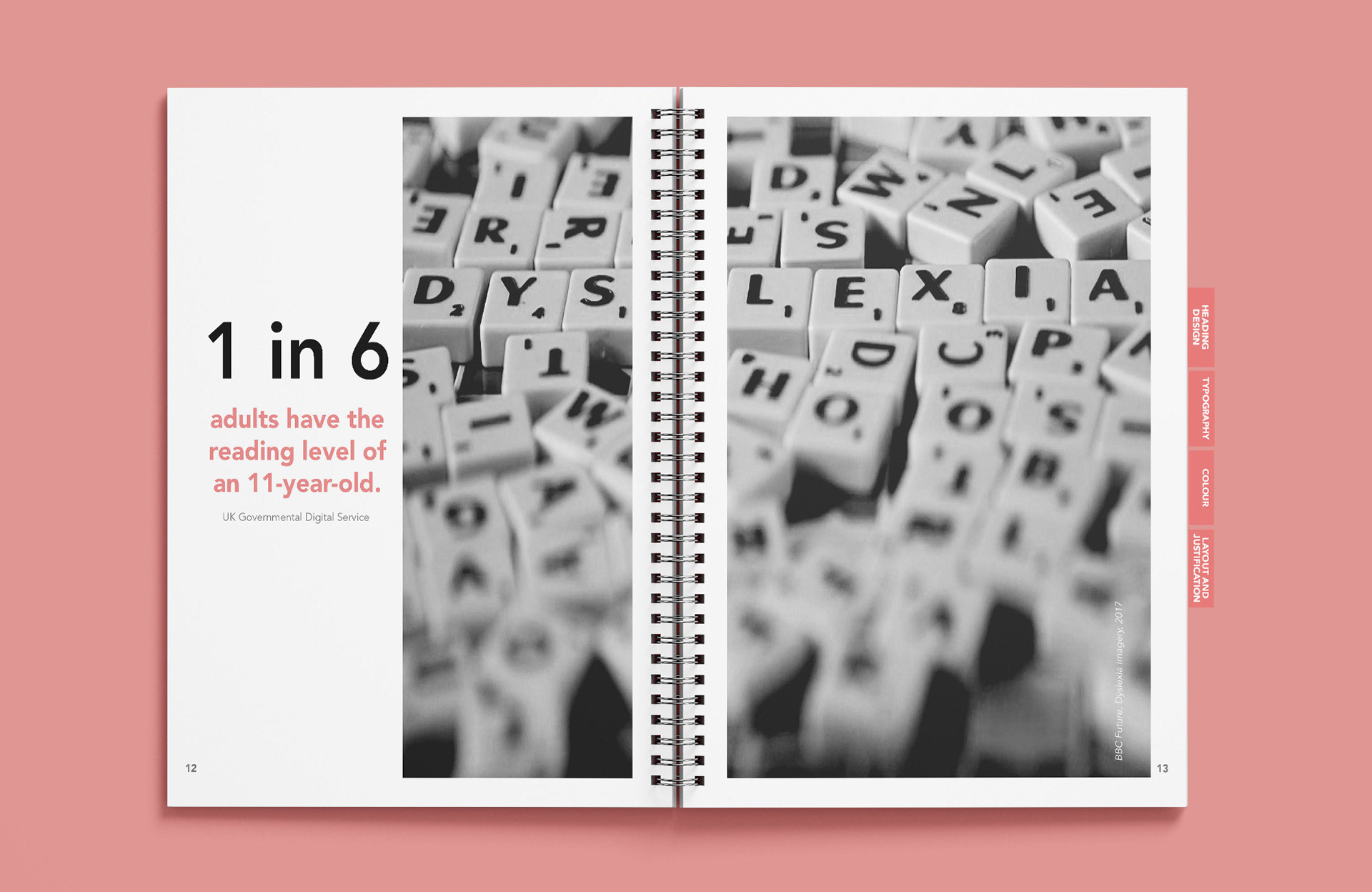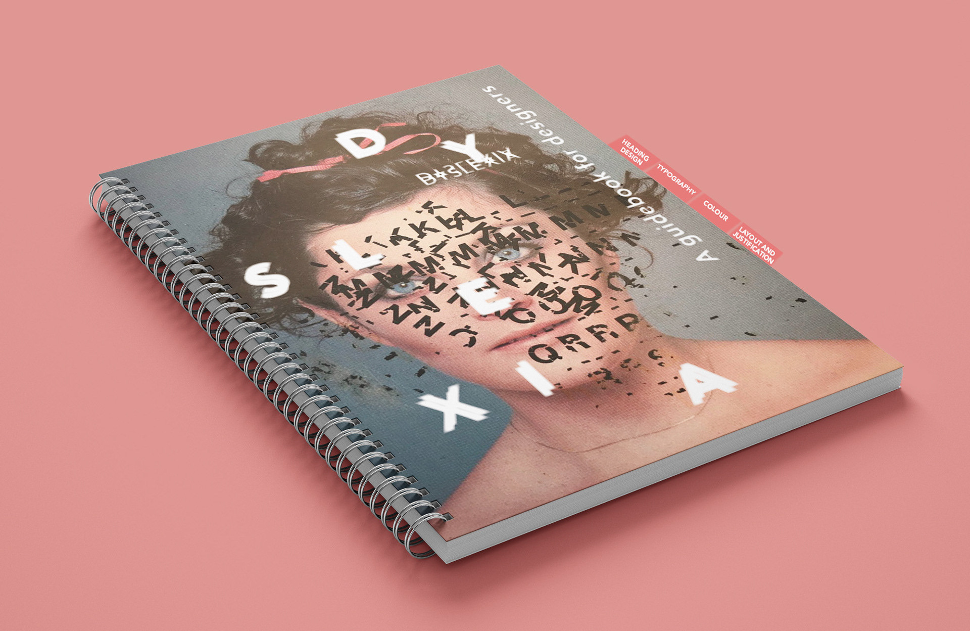
This project is a visually engaging guidebook aimed at educating designers on how to create accessible and dyslexia-friendly designs. The cover concept draws inspiration from the reading challenges faced by individuals with dyslexia, using fragmented and scattered typography overlaid on a portrait to symboliSe the visual confusion that text can present.
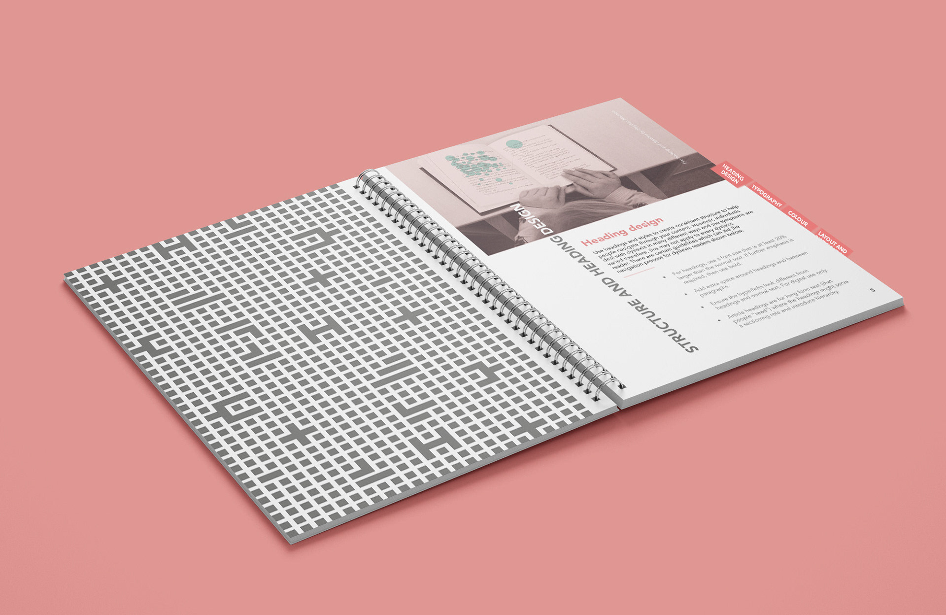
A clean sans-serif typeface contrasts with the disrupted letterforms to highlight the importance of clear, readable typography. The muted coloUr palette, soft pink background, and practical spiral binding give the guidebook an approachable and professional aesthetic. Tabbed sections; Heading Design, Typography, Colour, and Layout & Justification; help organiSe the content for ease of use.
The design combines thoughtful imagery and typography to not only convey the theme but also to set the tone for an informative and inclusive design resource.