Rebrand, Website and Magazine Design
Initially, I redesigned the brand in order for it to be implemented within all the deliverables. Four Seasons had existing brand guidelines which they required me to adhere to. For example, the shade of green which matches the uniform colour. In order to keep the identity recognisable, I made the typographic choice of changing the typeface to Futura from Avenir for a clearer logo as, the Four Seasons logo needs to be extremely legible for hoarding purposes at many scales. Futura is a modern typeface which can provide this.
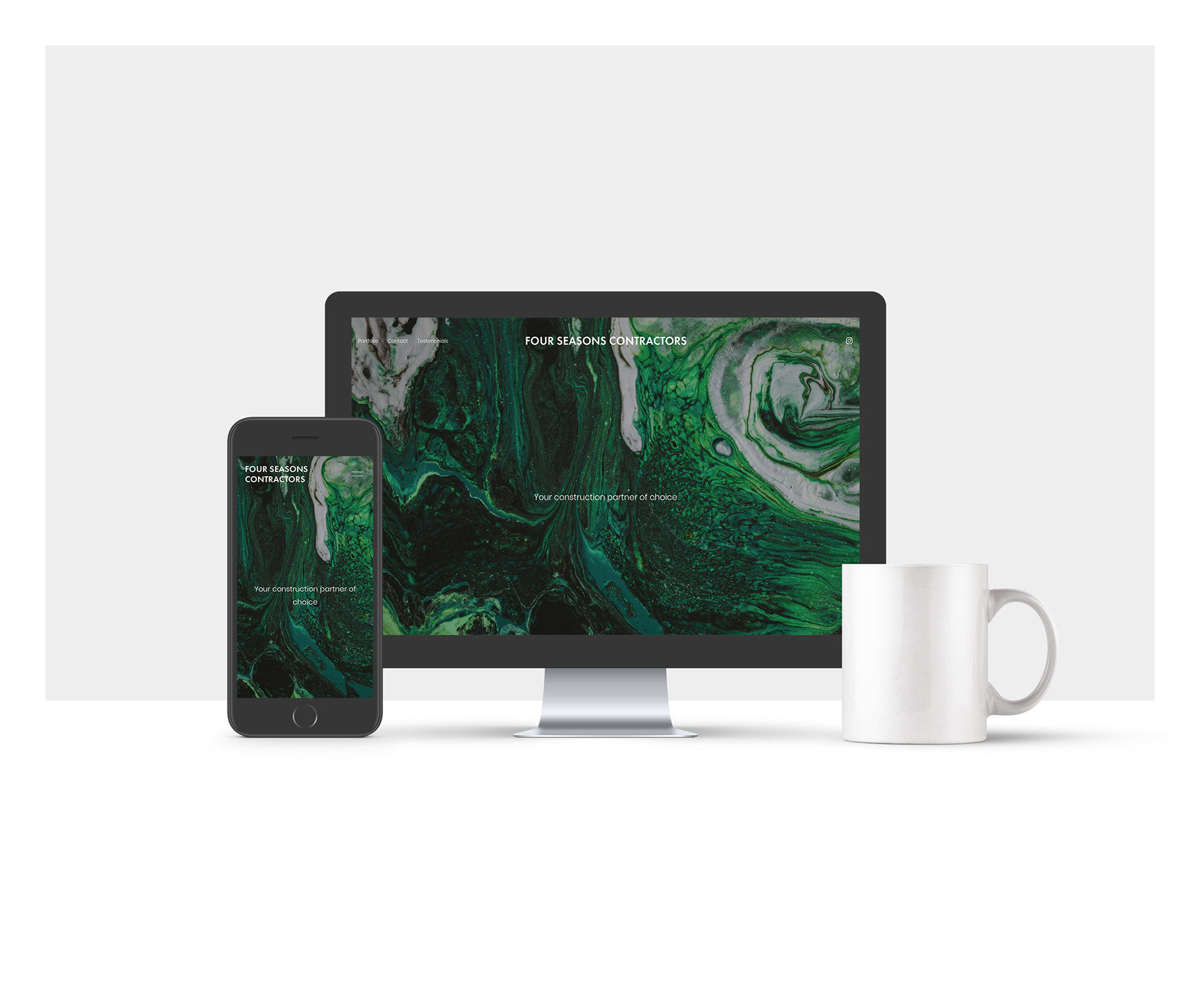
A website catered to display the construction portfolio including testimonials, contact and project forms. Additionally, seasonal magazine issues are being currently designed in order to promote the company every season and update clients on their projects and news around the construction industry.
Link to Four Seasons Contractors website